
At this point in its development cycle, Vista is wrapping up, pages are being stamped, and volumes are being closed. It’s not done, but it’s as close to RC1 as it can get, and Release Candidates are theoretically lock-down final bug-bashing opportunities, and not much gets changed at that point. So Build 5472 is for many a last opportunity to bug the irritations and annoyances that still remain in Windows Vista and we don’t plan to miss out on the fun!
No matter what people say about Vista, it does look great, but some things in a completely redesigned operating system scream “Look at me! I’m from the year 1991!” and leave us wondering what it is that’s actually happening at times. Here are some of the weirdest ranked in order of irritation.
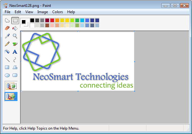
- Paint.
Microsoft has shipped the same program with its OS ever since Windows 3.11 and the same kids that first learned to use a PC and draw on Paint back in the day are now teaching their own kids to do the same: besides the top-aligned colors bar, nothing has changed! - Windows Mail Communication Dialog.
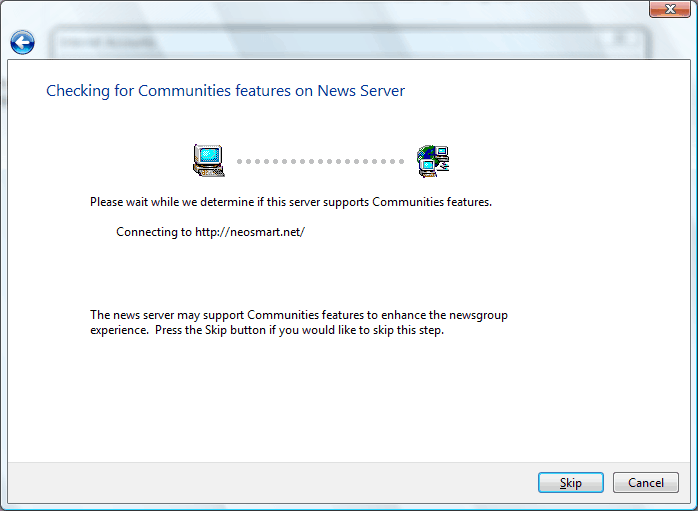
Windows Mail has been redesigned, coded from scratch, renamed, and rebranded – except for the Windows 95 icons on the communication screen of course.. What’s up with that!? - The Windows 2.0 Fonts Dialog.
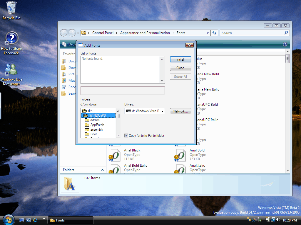
Vista looks great. It has 10 awesome new fonts, but what’s this? It still has the original Windows Font Dialog for new font installs? And the same crappy new font detection/installation routines too that come crashing down if a font is already installed? - The Internet Explorer Import/Export Dialog.
Internet Explorer 6 fell behind the browser pack, and it was survival of the fittest from then on, until IE7 came along and made a world of a difference, except for the import dialog from the 60s, but they’re doing something about it… we hope!
None of these things are major problems that would stop a consumer from buying an operating system if that’s all what’s wrong.. But they sure don’t look nice compared to all the shiny new controls and the otherwise-perfected icons and polished user interface, it just doesn’t feel right. Like they always say “If you’re going to do something, do it right.”
They’re placeholders you freaking retard and MSPaint has changed in other ways.
Placeholders??
You’re kidding me. Everything in the OS has changed from top to bottom, Windows Mail has been rewritten from scratch, IE7 has been given an overhaul, and you actually believe that this late in the program it’s still a placeholder? What about that bug reports closed as “Won’t Fix,” were they placeholders too?
Microsoft has the license to the amazing Paint.net and rumors are it -might- replace Paint in Windows Vista… But we have yet to see. As for the rest of the issues, let’s just hope they get fixed.
Microsoft holds the license to Paint .NET? Since when?
Read the fine print in the EULA my good friend 🙂
Just to be a little defensive:
There are some changes in Paint:
* Like you already mentioned, the top-aligned palette.
* Notice the nicer default colors in the palette.
* New icons in the toolbox.
* New zooming behavior (slider).
* A new tool on the Image menu, with which you can crop the image to the selection rectangle.
Also, in Windows 3.11, I think there wasn’t any Paint, but Paintbrush. Although I’m not sure about that.
I’m not a beta tester so I dunno what Vista is:
But I’m guessing some more:
– If you really take icons and graphics into consideration, then Vista still needs major work because somewhere in some remote dialog boxes and windows, plenty of legacy 16-color icons are bound to be still present. In fact they should’ve got rid of 16 x 16 sized icons because they really look tiny on high resolutions. Overall, they should’ve at least prettied up GDI+.
– Same goes for some 16-color AVI animations. In fact all graphical “resources” in files.
– At the time when Windows 95 came, 640 x 480 was the most common resolution, so the entire design of dialog boxes and windows is such that at 640 x 480 it wont go out of the screen. But they still haven’t enlarged few boxes and scrolling is unnecessarily required. In the HD age, they should’ve have designed it as per at least 1024 x 768 resolution.
– The command prompt buttons look horrible with the Classic Windows 2000 look.
– Calculator is way too basic although MS themselves have designed better free tools. Why haven’t they merged Calc Plus, Microsoft Student’s Graphing Calculator and XP’s PowerToy Calc?
– Registry Editor and Clipboard/Clipboard Viewer aren’t powerful enough, not updated
– They can’t have updated WordPad and IExpress
– Legacy codecs in VfW and ACM will still be present I guess
– True legacy utilities like Object Packager, Private Character Editor
– Inconsistent and legacy print dialogs
– Some added niceties like native ISO image viewing, editing & creation support would have been nice. No need to mount, no need to burn.
– Because MS has always supported proprietary standards rather than commonly accepted worldwide standards, DVD support is coming so late. Likewise, they could’ve added MPEG-4 AVC, AACplus and MP4 file format support to Movie Maker (btw does DVD Maker support Dolby Digital audio?)
I cant think of more things RIGHT NOW, but I’m sure there are plenty more.
First off all, No fixing can help Vista, it needs to be scraped 😉
Second, honestly, If some terrorist group bombed and shelled your city, would you not agree that someone needs to bomb the s*** out of them??? or maybe you’d just sit around waiting for your turn to get hit…