Ask your favorite typophile about the difference between Arial and Helvetica, and you’re sure to regret it… unless you have a latent appreciation for the differences between font faces, the attention given to kerning and hinting, and more. But ask them what’s the difference between Tahoma and Verdana, and you might just be surprised by the ensuing silence. Yet, these are two of the most popular online fonts, and have aged significantly well considering they share corporate roots with Comic Sans and Arial.1 If any fonts ever deserved scrutiny and attention, it’s these two.
Here are two lines of text, one in each of the two fonts in question:
Putting aside all discussion of any hinting issues (which you may notice on one line more than the other),2 there are some uncanny likenesses between the two. While it’s hard to immediately point out any structural differences between the characters, this image quickly gives us our first major hint as to the difference between these two popular fonts: the second sample is just simply bigger and a hair heavier, almost as if it were a “Tahoma Medium” if you will, rather than another font altogether.
The differences don’t stop there, however. Solely factoring in the larger width of the symbols in the Verdana font sample does not account for the extra word’s worth of x-spacing taken up by the second line. We can check this by dropping the size of the Verdana sample down to 10.5pt from its original 11pt to give us characters with approximately the same or even a little smaller in width as compared to those in the Tahoma sample, making it clear that there’s more to the variations in the line widths than that:
Before we dig deeper into the differences between the two fonts, let’s take a step back and explore their origins and design motivations. Both Verdana and Tahoma were introduced in Windows 95, as part of the collection of fonts commissioned by Microsoft for “the new PC era,” and designed by the legendary Matthew Carter of Georgia3 fame and then hinted to absolute pixel-perfection by Tom Rickner of the Monotype Type Foundry.
The purpose of this commission was to create a package of fonts that could be used for a variety of purposes sharing a common theme: all were meant to be primarily rendered/displayed on a computer screen rather than in print – a fairly novel concept for the font foundry titans of the era. The Microsoft-commissioned package of fonts was one of the first – if not the very first – attempts at creating fonts optimized for display rather than print; addressing issues such as legibility, kerning, letter spacing, and more as affected by the nature of the medium they would be displayed on (a color CRT monitor, for home users probably capable of producing a maximum resolution of 1024×768 but typically only SVGA/800×600 with an approximately 13″ diagonal) and its salient characteristics: an extremely low DPI (65-100 ppi), wholly different reading distances from printed text, zero literal ink bleed but plenty of “CRT fuzz,” poor RGB convergence, scan line artifacts, and pixels formed of individual RGB subpixel components (especially with the then-recent arrival of primitive LCD displays on the scene).4
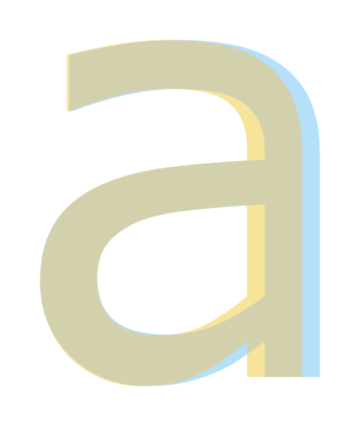
To that end, Matthew’s final package included both a serif font (none other than the beautiful Georgia) as well as the two sans serif fonts we are looking at today. What’s curious is that these two are essentially the same font, just adjusted for on-screen legibility differently—or, perhaps more accurately, to a different extent. To illustrate just how similar these two fonts are, here’s the letter a as it appears in both, superimposed atop of one another:

The letter a in Tahoma and Verdana, superimposed. The Tahoma sample is in orange while the Verdana sample is in blue, both at 40% opacity. The overlapping region ends up shaded in brown. Sample taken at 333pt.
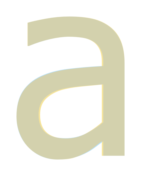
We can immediately see that they’re so similar, it’s not even funny. The biggest difference between the two samples is in their width; at 12pt the letter a is 0.072″ in Tahoma,5 while at the same point size the Verdana sample comes in at 0.077″ instead (i.e. ~7% wider). In fact, here’s what they look like when the Verdana sample is scaled in the x-direction down to 93.5% of its original:

The letter a in both Verdana and Tahoma, superimposed. The width of the Verdana sample has been scaled down to 93.5% of its initial value to match that of the Tahoma sample. The Tahoma sample is in orange while the Verdana sample is in blue, both at 40% opacity
If that’s not proof enough, then I’m afraid it’s likely nothing else will ever change your mind!
Looking at the scaled-down and superimposed sample above, we come to the other difference between the two: how the characters themselves were designed. Despite the fact that they’re practically the same font, we’ll see that Tahoma’s characters are drawn with counters a shade smaller than their Verdana counterparts.
In typography, “counters” are part of the design elements of a typeface and refer to the negative space formed by the connecting strokes in a character. Here, shaded in red, is the counter for the letter a from Tahoma:
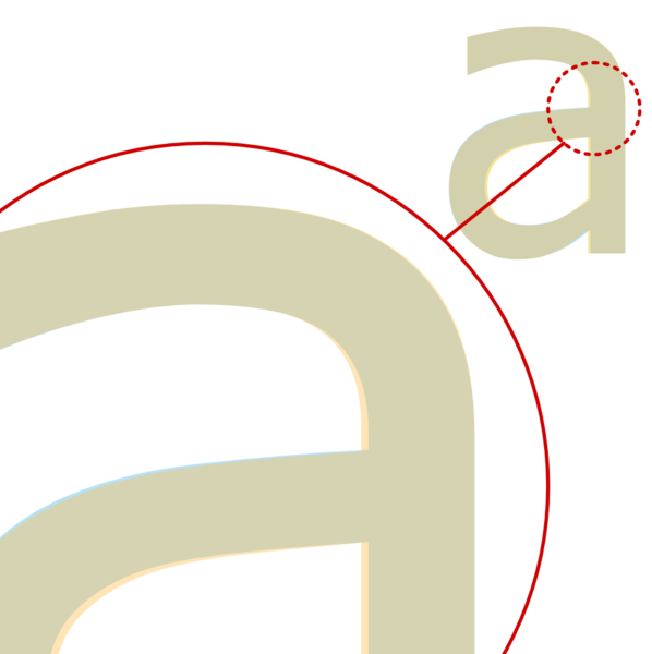
While both the Tahoma and Verdana samples in the last last specimen above start off in the top-left corner pixel-for-pixel identical, the downwards stroke of the Tahoma sample of the letter a gains a hair’s width as it becomes fully perpendicular to the x-axis, and retains this extra width the rest of the way down:

Both Tahoma and Verdana start off with the same stroke width, but the width of the stroke in Tahoma increases slightly as the it reaches its peak y value and retains the added width as it completes its stroke downwards.
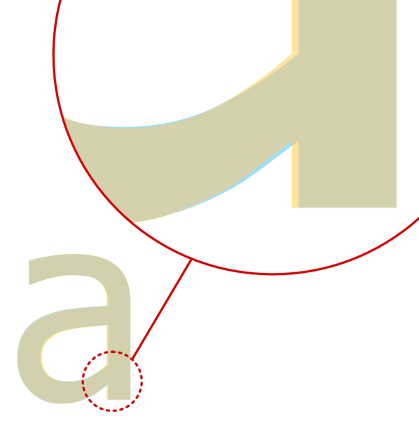
The same can be seen in the bowl of the letter a, where the leftmost stroke in the Tahoma sample inches inwards, reducing the radius of the bowl ever so slightly, then coming back in to connect with the stem just a pixel or two higher than the Verdana sample does (while having gone back to the same stroke width), also reducing the size of the counter in the process:

By virtue of simply re-joining the stem at a higher location than Verdana, Tahoma creates a smaller counter without needing to increase the stroke width.
While that just about covers the difference between the characters of these two fonts, there’s one final piece of the puzzle left. We come back full circle to the text samples in the opening paragraph and the difference in the line length between the Tahoma and Verdana samples, a difference not wholly accounted for by the differences in stroke size or the horizontal scale of the individual letters: the tracking.

Sample text in Tahoma (orange) superimposed atop a sample in Verdana (blue), the latter of which’s characters have been scaled down to 93% of their initial width.
Here we can finally see clearly the biggest difference between these two typefaces. With the individual characters in the Verdana sample scaled down to ~93% of their initial width, the only non-negligible difference between the two fonts is now their letter spacing: Verdana’s characters are spaced considerably farther apart than those of Tahoma. While they start off nicely lined up at the s, the situation deteriorates significantly from there until the l in Verdana’s sample is superimposed on top of the e from the Tahoma text, off by an entire letter’s width.
We’ve already discussed the various factors that contribute to legibility on a computer display, and it’s a fairly straightforward exercise to come up with individual features or characteristics of a display that would lead it to benefit in legibility by increasing the tracking6 of the letters. What’s not clear is the impetus that would lead to both of the fonts being chosen for inclusion with Windows 95 and making their way into web and PC history differing in this regard. If these are two font faces that are, for all intents and purposes, structurally and aesthetically identical, why ship with two (extremely) different letter trackings? If one tracking has superior legibility when it comes to on-screen displays, why include the other?
It’s a perplexing question and we could probably spend a lifetime theorizing without satisfactorily arriving at a consensus, but fortunately we don’t have to. The answer to this question can be found in a Typophile column titled Georgia & Verdana: Typefaces designed for the screen (finally) by Daniel Will-Harris,7 who interviewed Simon Earnshaw, then a typographer working at Microsoft:
The Verdana family started in early Summer 94 as a two font typeface (Tahoma), designed by Matthew Carter and hinted by Tom Rickner, to be used as a system font for Windows 95.
To make the fonts work in extended text settings, it was necessary to open up the counters more, widen the advance widths and loosen the spacing. Thus Verdana was born; effectively the more generous cousin of Tahoma.
And there you have it, straight from the horse’s mouth. The quote actually rephrases almost word-for-word what we independently arrived at above, but also answers another question we didn’t even ask: which of the two came first? It turns out that Tahoma is the original and Verdana was created to specifically optimize for certain requirements that required enhanced legibility—perhaps, some might even say, at the cost of aesthetics.8
As for what these “extended text” settings might include, it’s hard to say for sure based off of what little Earnshaw has given us to work with but just from what we know about how window forms are drawn under Windows, it’s likely a reference to the difference between text-heavy (“extended text”) and text-light regions. Unlike, say, a book, a system UI has quite the mix of design elements, and features text in a lot of distinct settings. Text might, in places such as titlebars and menus, resemble a newspaper headline or a photo caption while in others such as this very text here, comparisons to the body of a chapter book would be more apt.
Today there remains little resemblance to the original world of on-screen text as it existed in 1994. High-DPI screens are everywhere and the world of font hinting has moved from the original monochrome hinting approach, first to greyscale aliasing then color aliasing with ClearType under Windows Vista – which saw a virtual cornucopia of new, ClearType-ready fonts released to celebrate the occasion, and now hardware-accelerated text rendering with advanced capabilities like infinitely-variable stroke widths with the new OTF variable sized fonts feature when rendered with Direct2D/DirectWrite under Windows 10 and 11.9
So between these two fonts, which should you use? To this writer’s eye’s, Tahoma certainly has (at least to this amateur typographist’s eyes) better aesthetics and has been continuously extended with a richer character set and more symbols, while Verdana has somewhat languished in comparison over the years. Perhaps more importantly, the type hinting for Verdana seems somewhat lackluster, suggesting it may have been skipped over or given only the meagerest of attention from Microsoft’s typography division when it came to updating the fonts’ hinting to play nicer with ClearType and DirectWrite/Direct2D. And yet, some have a preference for the (extreme) bias towards legibility that Verdana presents, and given the right setting, it can certainly be a worthy choice. It’s your call, and you frankly can’t go too wrong with either.
If you’ve finished reading the article and believe you’ve internalized the differences between the two, do you think you can spot the difference in this final test? Verdana’s spacing and horizontal scale has been adjusted to match that of Tahoma – can you tell which is which?
This article was first published December 2017 and was revised to include more information and technical details in November of 2022.
Just to name two fonts that designers love to hate, though the circle is coming around and you’ll find plenty of Arial defenders too, these days. ↩
Given that these are RGB32 PNG screenshots, you may or may not notice hinting problems due to the complexities of Direct2D/DirectWrite text rendering — which takes into account the monitor, resolution, DPI, and actual pixel arrangement — some or all of which likely differ between the environment where the screenshot was taken and the phone or PC you’re viewing this image on right now. ↩
Georgia, in the humble opinion of this writer, is one of the most excellently designed, superbly hinted, and well-balanced general-purpose fonts available today, even all these years later. If you haven’t come across Georgia Pro before, you should take a look! It supplements Georgia with all the missing widths and some additional symbols, making it a great font to layout text in. ↩
Source: Typographically Speaking: The Art of Matthew Carter by Margaret Re, Johanna Drucker, James Mosley, and none other than Matthew Carter himself.
Not available on Amazon[update: you might be able to snag a copy here], but available on Google Books. ↩This keeps tripping me up every time I read it, but while there are canonically 72 points to an inch,
0.072"is just a coincidence! ↩“Tracking” is the distance between imaginary rectangles drawn tightly around each letter, while “kerning” affects the distance between the actual components of each letter and adjacent components of other letters ↩
http://www.will-harris.com/verdana-georgia.htm, precise date of publication unknown, but presumable circa 1995. [download archived PDF] ↩
But notice that while Tahoma was the original, the article refers to the fonts as “[t]he Verdana family” (emphasis added). I don’t have any answers there. ↩
And Microsoft is once more releasing a font to mark the occasion, and this time it’s Bahnschrift. More on that later. ↩


Hi Mahmoud,
nice article, was a pleasure to read. But i think, it is the totally wrong way to look onto the fonts in such a big, superimposed way. Those fonts were made for screens to be displayed in sizes at 8 pt without any ClearType or anything else. Take a text and display it in size 8, 9 or probably even 10 pt, like system fonts were displayed back in the time Win95/98 was released. The computer screens mainly had some 640×480 or 800×600 pixel of resolution. And in those sizes the differences are way more obvious. Tahoma in 8 looks good, Tahoma in 9 looks -in my opinion- quite strange, not as good readableas Tahome 8. Verdana 9 instead looks quite good again. Probably you update that article some day with ‘smaller’ examples. I would like to read your opinion.
Sincerely, Emil
Thanks for the article. On the last example I think Tahoma is the bottom line and Verdana is on the top.