
Much has been made of “home field advantage” in baseball – in particular, does playing at home vs away significantly affect a team’s outcome? Just how much impact does it have on a series’ outcome? What is home field advantage made of, anyway? Our favorite statisticians over at FiveThirtyEight once compiled a post about the disappearing effects of home field advantage for soccer in England, but what about the national pastime here in the USA? Buoyed by the Cubs’ recent success and egged-on by the MLB’s questionable interesting policy of awarding home-field advantage to the winner of the All-Star Game, we decided to see just what effect playing at home vs away has.
We went back 145 years and crunched the numbers from 210,719 baseball games to find out just what impact playing at home vs away has had over the past century-and-a-half of baseball… and then took it a step further with a look at some numbers on home field advantage by both team and park.
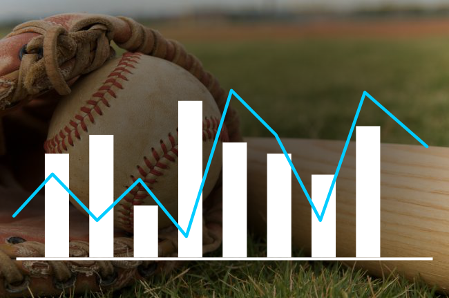
Home Field Advantage, 1871 – 2015
The chart above plots the percentage of games that were won by the home team (the wavy, blue line) in any given MLB season from 1871 to 2015. The solid, straight blue line is at the 50% mark, meaning each time the other blue line dips below that mark was a season where, on average, teams lost more games playing at home than away. As you can see though – with the exception of 1875 – it’s never the case. In case you weren’t convinced, just look at the wavy, green line at the bottom which charts how much better a team plays home vs away across the years – any time it deviates from zero, a home field advantage most definitely exists.1
It’s hard to look at the chart and say that home field advantage is waning. It has held fairly steady over the years, some dips and peaks here and there not withstanding. Taking into account the even distribution of teams vs parks (both the best and the worst teams host games, each game has exactly one home team and one away team), you would expect it to be an even 50% if home vs away had no impact on a team’s performance.2 Yet, the average over the past 145 years has been for teams to win 54.7% of the games they played at home and to win some 21.3% more games at home than away. For the 2015 season, teams on average won 54% of their home games giving them a home field advantage of a whopping 17.88%.3
What does a home field advantage of 17.88% and 54% of wins taking place at home translate to, though? A home win ratio of 54% means that a team can be expected to win one out of every 12.5 games played at home not because they’re the better team playing that day but because they’re on their home turf. Similarly, of every 13 games played away, a team can be expected to lose one game due to their visiting team status.
We’ve seen that this general trend has existed since the beginning of baseball (ups and downs aside), but what if there were more to be gleaned from the data? After all, we just looked at the average for all teams in a season. What if the team from city X gets particularly homesick and consistently does significantly worse than other teams when they’re on the road? Or maybe there’s a particular park that plays poor host to visiting teams and holds them at a significant disadvantage, be it due to the park itself or particularly-hostile spectators? Let’s find out.
Home Field Advantage by Team
This is a chart of each team’s average win record at home across all of baseball history, plotted against each team’s win record for away games.
As you can see, across the board teams do better at home than away – but for some teams it’s a bigger difference than others. It’s hard to see just how drastically some teams perform home vs away from the chart above since it doesn’t really take into account the “winningness” of a team, however. Here’s a better graph, this one plotting the percentage decrease in a team’s performance when playing away as compared to on their home turf:4
As you can see, it’s no longer “fairly even” or anything close to it. If you ever suspected that some teams – or maybe your own! – just don’t play as well when they’re away compared to others, this chart is all the proof you’ll ever need.
Top-Ten Away Teams
Here are the teams that are least affected by playing away from home – they have the lowest decrease in performance when playing away vs at home. Again, this is based off percentage decrease in win ratio, meaning it takes “winningness” into account, so these teams don’t necessarily have the best away wins record, just the most versatile:


Bottom-Ten Away Teams
These are the top bottom teams when it comes to playing on the road. It’s shocking to see the disparity on this end of the spectrum relative to the top ten above, but it makes sense: there’s no logical reason for a team to play better away than at home, so in the best case scenario good teams will trend towards an even 1:1 parity between their away and home performances, while on the converse there’s no real asymptote for just how badly a team can perform when playing away vs at home.


So that’s the list of teams that perform best and worst away from home – as you can see, it contains some surprises – not the least of which is just how badly some teams are affected compared to others when it comes to playing away from home.
Home Field Advantage by Park
So we have the average impact of home field advantage broken down by year throughout MLB history and the relative performance of MLB teams at home and away – but what factors aside from being more familiar with a field and more comfortable at home contribute to this effect? Let’s try to break down the impact of home field advantage by park and see if we end up with a trend.
Unfortunately, here we cannot just take the win-loss ratio for home vs away teams at a given park, nor can we use the individual performance of a team at each park to determine the impact the venue itself has on home field advantage. Why not? Well, if you have a team that is historically/statistically better than another, say the New York Yankees and their 27 championships, against a (again, only statistically) lesser team like the Florida Marlins, the odds are that the better team that season will win anyway. As such, it wouldn’t be fair to use that victory or loss directly in the determination of home field advantage – that would lead you to unfairly treat Yankee Stadium as being a particularly difficult park for visiting teams instead of treating games against the New York Yankees as being the challenge. And, of course, we cannot treat all teams as being equal but for the field they are playing at, no matter how easy of an oversight that would be to make when crunching the numbers.
If we don’t want to delve into a statistical analysis of actual game scores, which could be used to distinguish between winning/losing due to being a better/worse team and winning/losing by an even greater/smaller margin due to home field advantage, what we can do instead is plot how often we expected an outcome different from what we saw (historically) between all teams at the same venue.
While a physical stadium (generally) doesn’t change its properties much over the course of MLB history (renovations aside),6 good teams come and go across the seasons. So we need to first determine the impact of each venue by year, then look at the patterns over the seasons. For each season, we’ll compute the win-loss % for every team then “simulate” the expected outcome of each match at a given stadium and compare it to the actual result by venue. Taken on the whole, the deviations from our expectations will be used as an indicator of the impact the venue itself has on home vs away teams. Based solely off the win-loss percentage, our computation of a team’s seasonal performance is extremely naïve, but it doesn’t have to be more accurate than this since at the end of the day, the working assumption behind the entire MLB is that the net win-loss can be used to definitively order the performance of teams each year.
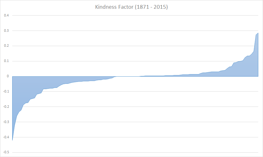
The results in the scatterplot above were obtained by going through each park, year by year, and giving it a “kindness” score. Each park’s kindness score starts off at 0, and each time a win is recorded at that park by a home team that had a worse win-loss % for the season than the visiting team, a point is subtracted from the kindness. Similarly, each time a visiting team with a worse win-loss % for the season bested the home team on their own turf, a point was added to the park’s kindness. No points were added or removed for games where the overall-better team won, as it is not possible to judge whether or not this was influenced by the venue. Finally, the net sum over the 145 years was divided by the number of games played at that venue to normalize what we call the “kindness factor.”
A kindness factor greater than zero indicates a park where visiting teams are more apt to win versus their hosts, while a negative kindness factor is associated with a bias towards the home team at the expense of visiting team. The kindness factor is plotted linearly in the chart above, and can be directly compared across parks. Note that there are too many parks for the legend on the x axis to fit them all, so be sure to hover over the (alphabetically-sorted) points for more info or if there’s a stadium you can’t see.
But over the course of 210,719 games in 145 years of MLB history, there are a lot of venues that we just don’t care about if we are looking for the impact of venues on home games today. If we filter the data to include only games from the past 20 years and additionally, where at least ten games were played,7 we end up with something like this:
This is where things get interesting (in a very geeky sort of way): while the kindness of parks overall between 1871 and 2015 was almost exactly what a statistician would expect, following a (fairly) normal bell curve:
The same data filtered to the years 1995 – 2015 is decidedly not evenly distributed:
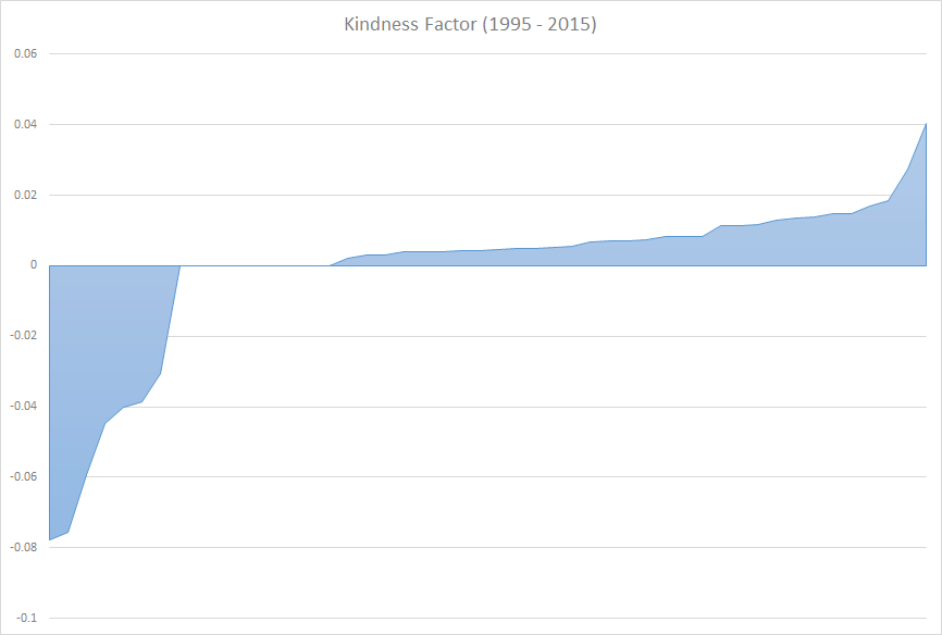
We see a definite shift in the effect that a field has on the outcome of a game over time: it matters less and less. And when it does matter, it’s in the opposite direction of where you’d expect it to be! The second chart shows very clearly that in recent years there are more “biased” ballparks likely to skew the results of the game in the favor of the visiting team than the other way around!
The fairest ballparks, 1995 – 2015
Taking the data from the charts above and breaking it down by park (filtering out those that do not currently host any major league baseball teams, just to keep the data relevant and interesting):
- Tied for first place, Busch Stadium III, home to the St Louis Cardinals, has a perfect 0 KF.
- Also tied for first place with a KF of 0 is Citi Field, home to the New York Mets.
- Also tied for first place with a KF of 0 is Marlins Park, home to the Miami Marlins.
- Also tied for first place with a KF of 0 is Nationals Park, home to the Washington Nationals.
- Also tied for first place with a KF of 0 is Target Field, home to the Minnesota Twins.
- Also tied for first place with a KF of 0 is Yankee Stadium II, home to the New York Yankees.
- In 7th place, Citizens Bank Park, home to the Philadelphia Phillies, with a KF of 0.00205.
- In 8th place, Safeco Field, home to the Seattle Mariners, with a KF of 0.00298.
- In 9th place, PETCO Park, home to the San Diego Padres, with a KF of 0.00309.
- In 10th place, AT&T Park, home to the San Francisco Giants, with a KF of 0.00386
It’s hard to come up with any sort of overarching pattern behind the fairest stadiums. You have all the different regions of the country covered, from coast to coast, with fair, wet, dry, warm, and cold weather all being represented. Equally, some of the teams that call the venues above their home make our list of top away teams and bottom away teams alike.
The 10 least-kind ballparks, 1995 – 2015
The same data, but for the ten venues with the lowest Kindness Factor numbers (i.e. most-likely to favor the home team against the visiting team).
- US Cellular Field, home of the Chicago White Sox, with a KF of -0.04486.
- Great American Ballpark, home of the Cincinnati Reds, with a KF of -0.04004.
- Oriole Park at Camden Yardens, home of the eponymous Baltimore Orioles, with a KF of -0.03855.
- Turner Field, home of the Atlanta Braves, with a KF of -0.03056.
And that’s it. The top ten is actually the top four, because these are the only parks in recent MLB history8 where the home team is given an “unfair” advantage! This is, of course, the Brave’s final year playing at Turner Field – so perhaps there are some surprises in store for their team come next season.
The 10 kindest ballparks, 1995 – 2015
This should need no additional explaining: it’s the list of parks with the highest KF scores, which is to say, parks where a “less-qualified” visiting team was more likely to beat the host team:
- It should come as no surprise that the venue bringing up the list of kindest parks to visitors comes from Canada’s one and only team: Rogers Centre, home of the Toronto Blue Jays, with a KF of 0.01480.9
- Kauffman Stadium, home of the Kansas City Royals, with a KF of 0.01365.
- Fenway Park, home of the Boston Red Sox, with a KF of 0.01302.
- Progressive Field, home of the Cleveland Indians, with a KF of 0.01128.
- Wrigley Field, home of the Chicago Cubs, with a KF of 0.00828.
- Tropicana Field, home of the Tampa Bay Rays, with a KF of 0.00827.
- Tied for 7th place, the Rangers Ballpark in Arlington, home of the Texas Rangers, with a KF of 0.007084.
- Tied for 7th place, the Angel Stadium of Anaheim, home of the Los Angeles Angels of Anaheim, with a KF of 0.007084.
- Chase Field, home of the Arizona Diamondbacks, with a KF of 0.00687.
- Minute Maid Park, home of the Houston Astros, with a KF of 0.00541.
It’s important to note that the “meanest” parks were not just mean – they’re an entire order of magnitude meaner than the rest. For example, a team visiting US Cellular Field is at a disadvantage four times greater than the advantage they would have had at Rogers Centre. Turner Field was also included on the short-list of meanest parks, and it’ll have to be seen whether the Braves will suffer from moving to a new field in 2017.
Another interesting tidbit is that Chicago is, curiously, the only city to make both lists, with US Cellular Field topping the list of meanest parks to visiting teams and the Cubs’ home of Wrigley Field taking the 5th place spot when it comes to the kindest venues for visitors.
As mentioned, all the KF numbers in recent years have been a lot kinder than they traditionally have been in baseball history. It does make sense upon reflection – as the fields get larger, the rowdiness of the players and their booing cries and jeers as the visiting team makes its moves are minimized or even eliminated.
What doesn’t make sense is why it seems that all but three of the current home parks of all MLB teams are actually ever-so-slightly biased in the reverse. Perhaps it can be boiled down to increased pressure to put on a good show on the road or maybe it’s something else entirely, but there you have it.
Impact on the 2016 World Series?
Of particular interest are Progressive and Wrigley Field, homes of the Cleveland Indians and the Chicago Cubs – the two teams vying for the win in this year’s World Series. These two fields are neck-and-neck with one-another when it comes to kindness, and both have a tendency to reward the visiting team over their own hosts, although the Indians’ Progressive Field does so by just a hair more.
At the same time, the Chicago Cubs appear on the list of teams that perform worse away from home, playing on average, 16.6% worse when away from home.. while the Cleveland Indians are a little safer at only -14.1%, by contrast. Will any of this matter? Probably not – but fans of both these teams all around the country are looking for anything that will give them the edge, after all, neither team has a won a World Series in over 50 years!
Thanks, caveats, and musings
This post would not have been possible without the data provided by the excellent and free retrosheets.org, which makes freely-available MLB data going back 145 years. The accuracy of this article hinges both on correct initial data and then sane, correct processing of that same data to get the correct results. Gracious thanks goes to avid Cubs fan, Dr Omar Al-Qudsi, for providing interesting baseball knowledge and sanity checks that this sports-illiterate author could not have done without.
The best effort has been made to ensure that the data and statistics above are correct and valid, and feedback or insight is welcome and encouraged. The MLB logo is trademark of Major League Baseball ® and the team logos are all registered trademarks of the MLB and/or their respective teams. NeoSmart Technologies ® is not affiliated with Major League Baseball ® or any of the major league teams, this article has not been paid for or sponsored by any other corporation or entity.
Final Thoughts
We’ve seen that home field advantage isn’t just a myth, and contrary to the naysayers’ claims, is anything but vanished in recent years. Home field advantage consistently gives individual teams anywhere from a 10% to 20% boost over the course of a season. It’s hard to say what exactly contributes to this home field phenomenon, but it’s probably safe to rule out the parks and the fans themselves – with or without their impact, the home field effect remains. In all likelihood, it is a combination of intense familiarity with a team’s own park and probably a not-insignificant dose of courage and stamina that comes from simply believing in the home field effect – a placebo, if you will.
It’s easy to just take these numbers and run with them, but you have to remember that statistics is a dual-edged sword. While it’s clear that some teams play better (relative to themselves) when compared to others, it’s important to remember that there could be a hundred other factors also affecting these results. A better study would take into account geographic factors such as temperature, humidity, and elevation; the proximity of the metro areas between “home” and “away” locations,10; and more. At the end of the day, the only thing we can say for sure is, plaaaaaaaay ballll!
For more interesting posts, fun facts, and witty analyses, be sure to subscribe to our posts by email from the sidebar to the right, follow us on twitter @neosmart, and like us on facebook.

A deviation above zero is a season where teams played better at home, a deviation below zero – which does not exist – would indicate a season where teams played better away. The green line is (home win ratio – away win ratio) / away win ratio. ↩
In the interest of honesty and openness, please note that in the name of keeping things simple, getting this article out sometime before the end of the century, and this author’s sanity, neutral venues were not taken into account. It is our opinion that games held at a neutral venue are a few and far enough in between to not account for even a blip in our data. ↩
It’s important to understand that this is a “percent improvement” calculation, meaning how much better teams played on average at home vs away compared to how well (or poorly) they played away. A 17.88% better-at-home-than-away and a 15.17% worse-away-than-at-home are actually one and the same. ↩
The plot shows ((away wins – home wins)/(home wins) ↩
Hey! The fact that the Cubs inspired this post has to count for something! Go Chicago! ↩
We do, however, distinguish between different stadiums rebuilt/moved carrying the same name, such as Busch Stadiums I, II, and III. ↩
This filters out special one-time appearances, temporary parks, parks used for rescheduled/resumed games, etc. ↩
Demolished or no longer home to an MLB team parks excluded ↩
The Canadians called.. they’re sorry they couldn’t be nicer, but apparently forfeiting the games outright just wasn’t option. I kid, I kid! Love you Canada! ↩
For example, a Cubs game at US Cellular Field or a Mets game at Yankee Stadium might as well be home games for both teams! ↩
Neuroscience would probably be the place to start when looking for an answer to home/away. There’s a strong neural pattern for performance at home since there are more games played at home than away. So players feel more comfortable at home.
Compare this to driving.
When you drive around your hometown, you have a strong neural pattern for the roads, the landmarks, the flow of traffic, the timing it takes to get somewhere, even the behavior of other drivers.
Now imagine you were sent to San Francisco and had to drive around. Then to Philadelphia. Then to Atlanta. Then Miami. You don’t know any of these cities. Meaning there’s no local pattern in your brain. This makes driving in those cities far more stressful.
You get to return home! And drive on the familiar streets again. How much easier is it? How much more relaxing?
But as you travel over and over to those other cities they become more familiar. The neural patterns strengthen. Driving there becomes easier. But never as easy as your home city.
Though maybe you go to San Diego for the first time and it just…feels right to you. So you like going there and driving there way more than you like going to Philly.
The difficult part for MLB players is that while the stadiums stay the same the opponents do not. There’s almost always new pitchers you’re facing. New hitters. It would be like if each time you went to a city they changed some of the traffic patterns, adding and removing entire streets. So there’s a whole other layer to this discussion.
I would like to see what this kind of study would show about individual performances
Your way of measuring park kindness factor seems odd to me. Aren’t you biasing the sample by omitting wins when the home team had a better record? Home field advantage might not work the same way in a losing season as a winning season. By only counting upsets it seems like you’d be overrepresenting the park effects of losing seasons, which probably wouldn’t be typical. Wouldn’t an easier way be to just compare home and away records for pairs of teams (i.e. Red Sox v. Cubs at Fenway against Cubs v. Red Sox at Wrigley)?