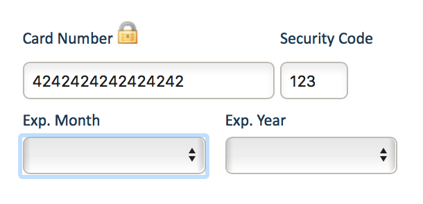
Every computer-savvy keyboarder has run into this problem before: you’re typing your merry way through a credit card payment form, pounding out your address and credit card numbers, tabbing between the fields so you don’t waste time mucking around with the mouse, when you come across the dreaded expiry date fields:
You groan. You know what’s coming next. Your card expires in April of 2019. Are they expecting you to type ‘A’ for “April” or to key in “04”? Or maybe it’s just ‘4’? Murphy’s law guarantees that whatever sequence you try typing these options in, it’ll be the last one you try. You sigh. You either try the different options haphazardly, holding your breath and cringing when it doesn’t change, or changes to select the wrong value. Finally, you give up and move your hand those excruciatingly-far 6″ to the mouse, and sigh in despair as you resort to clicking on the drop-down box and scrolling through the entries to select the one you’re looking for.
What if I told you there was a better way? And, no, it’s not doing something like graying-out some sample placeholder text and hoping your customers won’t be confused, thinking that was a pre-selected month/year. Here, try it out yourself. Just click in the first input field (“Just a place for you to start tabbing…”) then <tab> your way across the rest of the form and key your choice of month and year, in any format you like. The form will magically change itself based on who you are and what kind of preferences you have, and it’ll change accordingly to make sure that whatever you end up typing will work!
Oh my gosh! How did that work? Well, it didn’t really read your mind and it’s actually not magic (even if it seems that way) (and despite what I said before). It’s quite simple: the list actually contains all the variations of the month and year formats:
Then, with some clever javascript magic, we match up whatever the user selected to the “proper” format we wish the dropdown menu to show when they navigate away from the entry field. But it would be extremely confusing to less tech-savvy users if their drop-down contained multiple options evaluating to the same month – when you have to choose between “January”, “01”, and “1”, which do you choose? So the javascript hides the not “proper” options each time the drop-down menu is opened (via clicking or by hitting the spacebar) and returns the values when the menu is closed once more!
Here’s the full javascript code to pull this off. It’s using jquery, but there’s absolutely nothing complicated in there and it can be easily rewritten to use plain old javascript instead (it’s a GitHub gist, so anyone willing to do so, fork away!):
Each time the menu is opened, any <option> tagged with the class “extraneous” is detached from the parent <select> and stored in an array associated with the self-same <select>. Each time the user navigates away from the <select>, the drop-down menu is re-populated with the previously-removed elements. It works like magic on any <select> tagged with the class “magic” and should be fairly reliable! We’ve been using this code on the checkout page in both our online stores for the past few years and it’s been working great. Well enough, in fact, that we decided to share it with everyone!


hell yes you know life’s little nuances!