
With every new version of Windows or Office, Microsoft Corporation seems to generally like to package a couple of small freebies that make it a sweeter deal, after all, as they say: it’s the little things that count. Windows Vista and Office 2007 are no exception: not only is Microsoft apparently trying to make up for lost years (almost 6 for Vista, and four for Office), and it is doing a great job! At NeoSmart we’ve only had praise for the Office team, and we feel that the Microsoft Typography team is at the very least on-par with them, if not even higher… Once you’ve read this review, we’re sure you’ll agree.
The following are examples of 10 new Vista/Office 2007 fonts, taken in Office 2007 at 11 pts. Although Microsoft has made quite a few more new ones, these are the primarily Latin-based scripts that ship with every install, regardless of regional options. Notice that the majority of the fonts are sas-serif (at stark contrast with the theoretically more legible serif scripts for longer articles), and that, for some inexplicably odd reason, too many of them start with the letter C! (Not that we have anything against the letter C, but again, why?!)
All of these fonts have been optimized for screen-readability by the experts at the Microsoft Typography Labs; and for the first time in history, it is possible to have fonts that display great on the screen and look just as well on paper, thanks to the advanced ani-aliasing features and OpenType libraries employed.
Click each font to view a larger screen capture with a wider variety of letters, numbers, and characters.
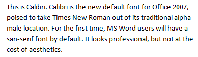
This is Calibri. Calibri is the new default font for Office 2007, poised to take Times New Roman out of its traditional alpha-male location. For the first time, MS Word users will have a sas-serif font by default. It looks professional, but not at the cost of aesthetics.
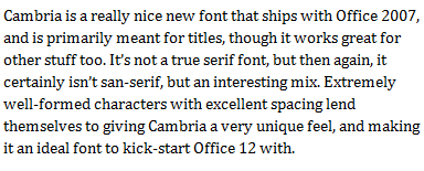
Cambria is a really nice new font that ships with Office 2007, and is primarily meant for titles, though it works great for other stuff too. It’s not a true serif font, but then again, it certainly isn’t sas-serif, but an interesting mix. Extremely well-formed characters with excellent spacing lend themselves to giving Cambria a very unique feel, and making it an ideal font to kick-start Office 12 with.
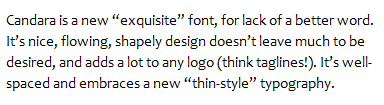
Candara is a new “exquisite” font, for lack of a better word. It’s nice, flowing, shapely design doesn’t leave much to be desired, and adds a lot to any logo (think taglines!). It’s well-spaced and embraces a new “thin-style” typography.
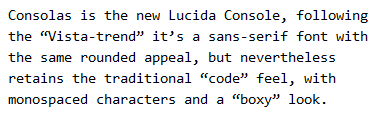
Consolas is the new Lucida Console, following the “Vista-trend” it’s a sans-serif font with the same rounded appeal, but nevertheless retains the traditional “code” feel, with monospaced characters and a “boxy” look.
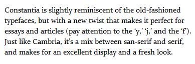
Constantia is slightly reminiscent of the old-fashioned typefaces, but with a new twist that makes it perfect for essays and articles (pay attention to the ‘y,’ ‘j,’ and the ‘f’). Just like Cambria, it’s a mix between sans-serif and serif, and makes for an excellent display and a fresh look.
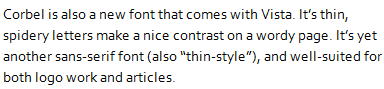
Corbel is also a new font that comes with Vista. It’s thin, spidery letters make a nice contrast on a wordy page. It’s yet another sans-serif font (also “thin-style”), and well-suited for both logo work and articles.
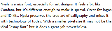
Nyala is a nice font, especially for art designs. It feels a bit like Candara, but it’s different enough to make it special. Great for logos and ID kits, Nyala preserves the true art of calligraphy and mixes it with technology of today. With a smaller pixel-size it may not be the ideal “essay font” but it does a great job nevertheless.
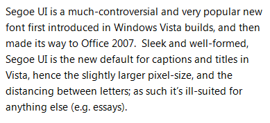
Segoe UI is a much-controversial and very popular new font first introduced in Windows Vista builds, and then made its way to Office 2007. Sleek and well-formed, Segoe UI is the new default for captions and titles in Vista, hence the slightly larger pixel-size, and the distancing between letters; as such it’s ill-suited for anything else (e.g. essays).
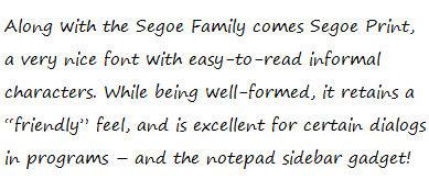
Along with the Segoe Family comes Segoe Print, a very nice font with easy-to-read informal characters. While being well-formed, it retains a “friendly” feel, and is excellent for certain dialogs in programs – and the notepad sidebar gadget!
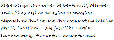
Segoe Script is another Segoe-Family Member, and it has rather amazing connecting algorithms that decide the shape of each letter per its location – but just like cursive handwriting, it’s not the easiest to read.
[images in greyscale] [digg this] [this article in spanish] [microsoft typography] [weft iii]
I think Candara is the most Web-2.0 out of all the ones on top.
Excellent review man!
Ha… I thought so too.
(Have you noticed the new NeoSmart Logo? Guess what one of the fonts is!
Beautiful fonts, I hadn’t noticed Nyala before! I love it!
Is there any chance of getting these fonts on Windows XP? I already have Segoe UI, but none of the others. 🙁
Install the free Office 2007 Beta 2 and you’ll get 8 or 9 of them 😀
As someone who prefers to use OSS, Office and Vista just fill me with dread, but these fonts are actually supprisingly good.
I want Consolas for Notepad ! Too bad I gotta have visual studio installed to use it. Nice overview of these new fonts!
The fonts probably predominantly start with ‘C’ to keep them at the top of the alphabetically-sorted font list, as well as together. I think that it’s a good choice.
I should have thought of that :\
why letter C, my guess is when we type C (font section field) in keyboard all the new fonts will be listed, so it easlier for newbies if they want to make an extensive of newer onces but find hard to remember names!!
“…for the first time in history, it is possible to have fonts that display great on the screen and look just as well on paper…”
I think you mean for the first time in history on MS-Windows systems. Mac OS X has had an advanced anti-aliasing system in place for a few years now.
Does anyone else think Candara looks a lot like a variation of Albertus? This isn’t a criticism… I’ve always kind of liked the Albertus family but it’s never had any representatives hit the mainstream yet on either MS-Windows or Mac OS. From looking at the samples above quickly it reminds me a lot of Albertus, but there are (of course) differences too.
Actually they use the letter C because all of the 6 fonts that start with the C have been made with ClearType in mind. Just try disabling font smoothing completely and you’ll notice that those fonts aren’t even hinted, and look ugly without ClearType.
Sorry for double posting, can’t seem to edit previous post, but here’s a good video that talks about most of those fonts (there’s also a mentions about why they start with a C)
http://channel9.msdn.com/Showpost.aspx?postid=146749
“I think you mean for the first time in history on MS-Windows systems. Mac OS X has had an advanced anti-aliasing system in place for a few years now.”
Have you ever used Windows?
About Microsoft’s Segoe
“The EU throws out Microsoft’s Vista font trademark”
http://arstechnica.com/news.ars/post/20060404-6517.html
(sorry if this is double posted, this form desn’t seem to work in Firefox, I had to resubmit with IE – [ugh!])
Not completely off-topic… What font is being used on this web page for the body and titles? I really like them both!
Nice review! Any idea what the license(s) will be for these, i.e. will I be able to find them online (legally) and use them on my Linux system?
Although not obvious (without doing a web search) Nyala was primarily added to Windows to support the Ethiopian writing systems – the Latin portion is quite nice regardless. Cheers, Si
…oh and try Segoe Script in Vista Notepad – the contextual OpenType isn’t working in your sample.
@J.
Windows XP introduced ani-aliased fonts before OS X, and I believe before mainstream linux as well, but it was not perfected until now.
@James: Believe it or not, Calibri is set to the first default font 😀
@Anthony: They will ship with Windows Vista and Office 2007, so if you get one of them you’re entitled to use these fonts. They will also be available at a price for direct download off of Microsoft for Macintosh and Linux users.
@Si: You are correct. Thanks.
I’m Stunned! It looks just a tiny bit different, but it makes all the difference in the world! I’m on my way out, but I’ll update the screenshots later. Thank you!
RISC OS had antialiasing from about 1990 as did BeOS. So the argument about which came first – OS X or XP AA is irrelevant.
How complete are the char sets for these fonts – do we actually get SC & OSF fonts and are there Expert sets too? What about Greek and Cyrillic characters – for maths work they’re crucial though of course no one in their right mind would choose Word over LaTeX for maths setting… what format are they supplied in – OTF or TTF?
Yeah, those are all included.
Cambria comes with a special font called Cambria Math as well….
From http://blogs.msdn.com/michkap/archive/2006/04/04/567881.aspx :
Calibri: Latin/Greek/Cyrillic Latin, Greek, Cyrillic
Cambria: Cambria Math Latin/Greek/Cyrillic Latin, Greek, Cyrillic Math
Candara: Latin/Greek/Cyrillic Latin, Greek, Cyrillic
Consolas: Latin/Greek/Cyrillic Latin, Greek, Cyrillic
Constantia: Latin/Greek/Cyrillic Latin, Greek, Cyrillic
Corbel: Latin/Greek/Cyrillic Latin, Greek, Cyrillic
That’s an excellent link, check it out.
Um…there’s a bug in WordPress, I can’t unsubscribe from the email notifications.
Could you fix it? 😀
Remake those screenshots without ClearType. The color-bleeding is awful, even on an LCD. ClearType takes the display’s subpixel order into account, something which a prerendered picture just cannot do.
I really like Nyala :-). I hope that someone will “remake” it and release it for linux 😉
Segoe UI is very similar to Myriad, though may be slightly thinner.
I’ve uploaded an example of myriad here, compare it to Segoe UI and see what you think!
Incidentally, iPods with a colour display use the font Myriad for their UI, so it could be that Windows Vista’s title bars will look very similar.
Could this be a deliberate decision on Microsofts part? Or is that too cynical?
Perhaps a simpler answer is that both Apple and Microsoft happen to agree that this is a very readable font.
I like the fonts, but cleartype gives em a headache. On TFT’s nothing looks better than non antialiased pixel perfection. That my opinion anyway. Cleartype is nasty.
Please, as many have already said, post some greyscale antialiased versions, those colourful cleartype renderings are horrible on CRTs TFTs with a different colour order.
It could be interesting so see how the fonts render with freetype, making some samples using the GIMP might be useful
@Andy
Segoe UI is actually identical to Frutiger (45 light)
Microsoft has already admited this by the way.
http://jules.vslcatena.nl/frutiger.jpg
Fonts that are sort of a mix between serif and san serif are called semi serif’ed.
I’m working on the email subscription bug, it’s something to do with WP SVN… I’ll let you know when that’s fixed – my apologies.
Per popular demand, a link to greyscale renders of the above-listed previews have been added. Please note, these renders are not done without ClearType, but have simply had their color info dropped. As such, they contain the hinting in design and AA features, but won’t look as good on a TFT-LCD Monitor – but if you have an LCD with different subpixels or a CRT, you might enjoy them more.
Cheers!
-CG
Update: We have fixed the email notification bug, sorry for the trouble. Feel free to use the link beneath the reply box to subscribe/unsubscribe/change delivery options.
Regards,
CG
For some slightly more interesting and indepth coverage of a few of the fonts, you may wish to look at http://www.poynter.org/column.asp?id=47&aid=78683
“Have you ever used Windows?”
Yes, of course, and in fact I’m one of those “lucky” ones who right now has to deal with both an MS-Windows box and a Mac on my desk at the same time. I even have to occasionally use X-Windows in either its GNOME or CDE manifestations depending upon whether I need to use Linux or Solaris.
I wasn’t trying to start a flamewar — each platform has its place. The point I was trying to make was that anti-aliasing fonts is hardly new tech. Computer Guru posted the clarification that it hasn’t been perfected until now, but I still maintain that this claim is only true for MS-Windows — it’s been working fine on Mac OS X with its monitor-based variable font smoothing style for years (and as Matthew posted both RISC OS and BeOS have long had it too, and I’d personally be surprised if Amiga OS didn’t also feature it). As far as I can see, it’s just a case of an existing tried-and-true tech being made more mainstream, not a case of an earth-shattering new tech finally becoming perfected for the first time ever anywhere.
I don’t have the Segoe Print?
Jan
Segoe Print doesn’t ship with Office, it only comes with Vista… which you can now get free!
http://neosmart.net/blog/archives/183
Always a bit difficult to use design and Microsoft in the same sentence but these are a vast improvement over the likes of Trebuchet and Comic Sans. However when it comes to Microsoft, there’s always a caveat: they’re proprietary – nothing ever emanates from Redmond that might be even considered in an open source context.
The consistently irreverent side of my multi-modal personality requires that I ask: so who named these fonts?
The same guy who?s naming Toyotas?
Calibri, Cambria, Candara, Consolas, Constantia, Corbel?
hmmm, sounds kind of like Camry, Corrolla, Cressida, Celica, Corona, Crown, Carina…
That’s really not fair.
Microsoft has an entire section devoted to open source (and, no, I’m not talking about the “it’s all an act” Open Source Linux Labs at Microsoft – that’s a joke).
Microsoft Research works on it’s own open source license (they call it “shared source”), that’s far more flexible than many of the more popular OS licenses out there today.
And, they don’t just make “free” software that’s useless, I’m talking about real hard-core innovation (making one wi-fi adaptor connect to two networks at once!?)
But yeah, I agree, the naming scheme is scary 😀
(a) Those fonts aren’t “a mixture of serif and sans-serif”. They’re serif fonts, period. What on earth do you think makes them “not true serif fonts”?
(b) Segoe UI damn well is not identical to Frutiger, and I don’t know how someone who actually has a Frutiger installed can be stupid enough to claim it is. It’s even LESS similar to Frutiger than (e.g.) Arial is to Helvetica, because you can at least replace Helvetica with Arial and your layout will not change, while replacing Frutiger with Segoe UI will totally reflow your document. It also has major differences in many letter shapes: look at the shape of the dot on “i” or “j” (round like Myriad, not square like Frutiger), or at the tail of the Q, or at the capital J, or indeed at just about any other fucking letter. They are totally different and trivially distinguishable for anyone with half a clue.
Just as a footnote, you all might like to know, the proper term is ‘sans-serif’
http://en.wikipedia.org/wiki/Sans-serif
Note, the extra ‘s’.
I’m glad people seem to like the Nyala design, but I was a little surprised to see it discussed in this context. Nyala is primarily an Ethiopic typeface, supporting the ancient syllabic writing system now used to write most of the languages of Ethiopia and Eritrea. Geraldine Wade at Microsoft drew the initial Ethiopic characters, and I revised them and then added the Latin companion design that is showcased in this blog post. The Latin design primarily exists to supplement the Ethiopic, and is designed to harmonise with it visually, to facilitate bilingual texts and the occasional use of English or other Latin-script words in Ethiopic text. So it was a surprise to see the Latin design being considered on its own merits, but gratifying nonetheless.
Hello John,
Seeing as your on the design team, the first thing I have to say is: you guys did an amazing job (as you can see by reading the comments).
To be totally frank, we had 9 fonts and needed one more. All the other primarily non-Latin scripts had standard barely-not-arial (or some other stock font) but Nyala had a Latin script that looked like it was well thought out.
New fonts are pretty terrible. Good that Bill Gates is retiring. As a Swiss give me ‘Helvetica’ any time. We use Arial in preference. Sorry MS !!!!
Bill Gates has nothing to do with the fonts, and just because Helvetica is nice (I do agree), it doesn’t mean these are terrible, even if Helvetica is nicer….
Hello,
I have surfed on the net I have found your blog. It’s amazing.
Your blog is great, thanks.
Please, as many have already said, post some greyscale antialiased versions, those colourful cleartype renderings are horrible on CRTs TFTs with a different colour order.
It could be interesting so see how the fonts render with freetype, making some samples using the GIMP might be useful
They can be gotten here:
http://jeffmilner.com/index.php/2005/07/30/windows-vista-fonts-now-available/
Where are the images man!?
None of them are showing, and this is the only good it on Google!
Someone else below asked this already.
I am getting nailed with Spam in my website for our blog website. Is there anyway to stop this? If not, there really isn’t any point in leaving it up and active. Any help will be greatly appreciated. http://www.profesjonalna-reklama.pl
Thanks Keep up the good work. Greetings from Poland