
With every new version of Windows or Office, Microsoft Corporation seems to generally like to package a couple of small freebies that make it a sweeter deal, after all, as they say: it’s the little things that count. Windows Vista and Office 2007 are no exception: not only is Microsoft apparently trying to make up for lost years (almost 6 for Vista, and four for Office), and it is doing a great job! At NeoSmart we’ve only had praise for the Office team, and we feel that the Microsoft Typography team is at the very least on-par with them, if not even higher… Once you’ve read this review, we’re sure you’ll agree.
The following are examples of 10 new Vista/Office 2007 fonts, taken in Office 2007 at 11 pts. Although Microsoft has made quite a few more new ones, these are the primarily Latin-based scripts that ship with every install, regardless of regional options. Notice that the majority of the fonts are sas-serif (at stark contrast with the theoretically more legible serif scripts for longer articles), and that, for some inexplicably odd reason, too many of them start with the letter C! (Not that we have anything against the letter C, but again, why?!)
All of these fonts have been optimized for screen-readability by the experts at the Microsoft Typography Labs; and for the first time in history, it is possible to have fonts that display great on the screen and look just as well on paper, thanks to the advanced ani-aliasing features and OpenType libraries employed.
Click each font to view a larger screen capture with a wider variety of letters, numbers, and characters.
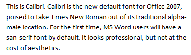
This is Calibri. Calibri is the new default font for Office 2007, poised to take Times New Roman out of its traditional alpha-male location. For the first time, MS Word users will have a sas-serif font by default. It looks professional, but not at the cost of aesthetics.
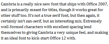
Cambria is a really nice new font that ships with Office 2007, and is primarily meant for titles, though it works great for other stuff too. It’s not a true serif font, but then again, it certainly isn’t sas-serif, but an interesting mix. Extremely well-formed characters with excellent spacing lend themselves to giving Cambria a very unique feel, and making it an ideal font to kick-start Office 12 with.
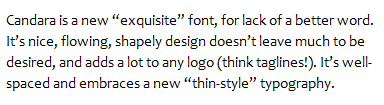
Candara is a new “exquisite” font, for lack of a better word. It’s nice, flowing, shapely design doesn’t leave much to be desired, and adds a lot to any logo (think taglines!). It’s well-spaced and embraces a new “thin-style” typography.
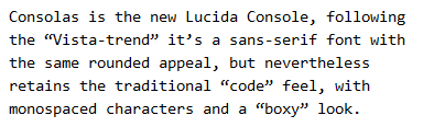
Consolas is the new Lucida Console, following the “Vista-trend” it’s a sans-serif font with the same rounded appeal, but nevertheless retains the traditional “code” feel, with monospaced characters and a “boxy” look.
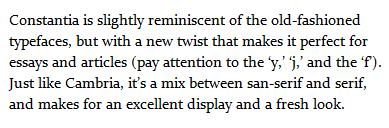
Constantia is slightly reminiscent of the old-fashioned typefaces, but with a new twist that makes it perfect for essays and articles (pay attention to the ‘y,’ ‘j,’ and the ‘f’). Just like Cambria, it’s a mix between sans-serif and serif, and makes for an excellent display and a fresh look.
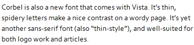
Corbel is also a new font that comes with Vista. It’s thin, spidery letters make a nice contrast on a wordy page. It’s yet another sans-serif font (also “thin-style”), and well-suited for both logo work and articles.
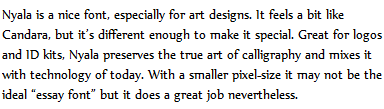
Nyala is a nice font, especially for art designs. It feels a bit like Candara, but it’s different enough to make it special. Great for logos and ID kits, Nyala preserves the true art of calligraphy and mixes it with technology of today. With a smaller pixel-size it may not be the ideal “essay font” but it does a great job nevertheless.
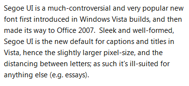
Segoe UI is a much-controversial and very popular new font first introduced in Windows Vista builds, and then made its way to Office 2007. Sleek and well-formed, Segoe UI is the new default for captions and titles in Vista, hence the slightly larger pixel-size, and the distancing between letters; as such it’s ill-suited for anything else (e.g. essays).
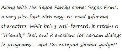
Along with the Segoe Family comes Segoe Print, a very nice font with easy-to-read informal characters. While being well-formed, it retains a “friendly” feel, and is excellent for certain dialogs in programs – and the notepad sidebar gadget!
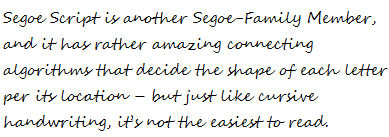
Segoe Script is another Segoe-Family Member, and it has rather amazing connecting algorithms that decide the shape of each letter per its location – but just like cursive handwriting, it’s not the easiest to read.
[images in greyscale] [digg this] [this article in spanish] [microsoft typography] [weft iii]
Great article and excellent theme. The tips it’s very useful for my website I am dealing with today for.
“Sans serif” means “without serif” in french. “San serif” on the other hand doesn’t mean anything in any language.
Great article – radu – thanks for info about san serif;)
The color-bleeding is awful.
Wasn’t there a link to a grayscale pack somewhere here?
The color bleeding is horrendous on CRT monitors, but on my other PC w/ an LCD, it looks great.
Can someone put the Grayscale link back up, please?
For some reason all the links that used to be at the bottom of the article had disappeared, including those to the greyscale reneders. I’ve re-added the links along with a couple of new ones, hope you find that helpful.
The greyscale renders take care of the color-bleeding for those of you with a monitor RGB profile different from the one these were rendered on.
[download] (70 kb)
For me Ofiice 2000 is ok, no errors.
I really got to say that these fonts look great and I like that Windows makes so many of new styles.
On my side it often took a long time to find the font, i want, but with the possibility to choose out of more, this gonna be easier 😉 ^^
Re: a-comprehensive-look-at-the-new-microsoft-fonts/
[microsoft typography] This link is misstyped… mising the “:” behind http.
Thanks for the heads-up!
Link updated.
Who was that fuckin moron to name all fonts with ‘C’?
Btw, Vista is a steaming pile of shit, and Windows font smoothing is a joke, you fuckin retards.
If you can send me the TTF files, I can include them in the next release of the Web Core fonts for Linux, which already includes Verdana, Tahoma, etc.
I just checked out windows vista last week. This founds are a very good recommandation, much more easy to read on screen, more usefull than the classic Arial I used before.
Nice review! Any idea what the license(s) will be for these, i.e. will I be able to find them online (legally) and use them on my Linux system? Please reply
So far, they’re under the same proprietary license covering Windows’ resources.
In the past, Microsoft has been very lenient with the distribution of Windows’ icons, sounds, dlls, and fonts – but note that this doesn’t mean it’s actually legal!
Some of the sites posting trackbacks to this post have the fonts available for download.
Nice review! I like the last two fonts the best.
I think that Vista fonts are better than XP fonts.
You give nice examples. I will digg this article 🙂
Is it that no one knows the difference between
it’s
and
its
or is it that no cares?
Well for me its or it’s no care or i dont or don’t care or aaaahhh whatever 😕
Sure, feel free to translate it to any language you want. We just ask that you link back and name us as the source in the beginning. Once you’ve translated it, just post back and I’ll link to the translation too. 🙂
Okay, I give up – what is the font for the new NeoSmart logo? I really like it.
Thanks, Steve! 🙂
It’s a hand-touched version of Candara & Footlight
I like the new Fonts, thank you for this comparsion!
it’s “sans serif,” not “sas-serif” or “san-serif.” all three appeared in your post… is it really that hard to proofread an article about typography?
It is when the text is an image capture 🙂
try install some open source font, it works a lot better
What works a lot better?
You can argue that these Vista fonts look even better on Linux than they do on Windows thanks to GTK’s better “cleartype” engine; but if you’re saying that “open source” fonts look nicer than “closed source” fonts… then you’ll have to be a bit more specific than that.
How to install these new Vista fonts on Linux. The link also includes an alternative approach for OpenOffice.org users who cannot/will not install the Vista fonts because of license reasons.
IANAL, but in certain cases Linux users can install the Vista fonts. Also, I think you cannot redistribute neither the new Vista fonts nor the old web core fonts with as tarballs or RPMS.
These Fonts are very cool but where Can I download them ?
You don’t, they come with Windows Vista and Office 2007.
Emmanuel and Mahmoud Al-Qudsi, yes, you can download these fonts! The instructions and links are here: http://www.oooninja.com/2008/01/calibri-linux-vista-fonts-download.html
I have these on a new Dell notebook w/Vista & Office 2007. On my XP desktop, however, I have Office 2003 but I also installed OneNote 2007 stand-alone. That gave my XP machine most but not all of the new typefaces; it is missing the Nyala, Segoe Print, and Segoe Script. Oddly enough I wanted to try the Script just for the heck of it. Have to wait till tomorrow when I fire up the notebook again!
I wonder why they excluded those few from OneNote 2007? Beyond that, I wonder if they aren’t actually on the installation CD for ON 2007 but not loaded with the “Typical” setup – MS has a habit of doing that a lot.
Personally I really like Calibri, the new default for Office. I’ve made that the default in Office 2003 as well!
I really have to say that these fonts look great and I like that Windows makes so many of new styles.
Finally Microsoft came up with something useful…
Something usefull? i still dont like Microsoft and their products, they should try to make their os run better and much more stable!!
The big advantage of Consolas from a programming perspective is that 1 (one) I (capital i) and l (lower case l) are all clearly different as well as zero being crossed. There are very few fonts that enable clear distinction to be made in all these areas.
Proggy (http://www.proggyfonts.com/index.php?menu=download) is another font family that does that but is limited in appeal as it is designed to be used at one size. It is also available for X-windows and Macs
Rgrds
F
Great article… But what font will be shown on a website for users, who don’t have Vista installed? If I use one of this fonts on my website, will it be also shown for non-Vista users???
That all depends on your CSS code. You specify the fonts to show in the order they should be tested. If the first one (a Vista font) doesn’t exist on the users’ computer, the next one will be tried, and so on and so forth.
Cambria surely is stylish, wonderful letter mask.
I like the fonts, but cleartype gives em a headache. On TFT’s nothing looks better than non antialiased pixel perfection. That my opinion anyway. Cleartype is nasty.
The big advantage of Consolas from a programming perspective is that 1 (one) I (capital i) and l (lower case l) are all clearly different as well as zero being crossed. There are very few fonts that enable clear distinction to be made in all these areas.
Censored by NST
Is there a way to show this fonts also for visitors of my site, which don’t have vista or the vista fonts installed?
Could it for example be offered for automatic download when someone visits my site?
Or is it only viewable for people with vista installed?
Take a look at Microsoft WEFT: http://www.microsoft.com/typography/web/embedding/weft3/default.htm
These fonts are great! Thanks for presenting them… Does anyone know where to download these fonts for Windows XP?
Hello, I always have a problem with new fonts. When I use them on my website I can see them but the visitors of the site don´t. Do they have to have installed the same fonts on their PC?
@ Colostrum: you should read the reply to Schmuck and you´ll hav the clue!
i lkie the new vista fonts! *modern*
vista is bad and the fonts also!
I like Cambria out of them, similar to arial a little bit.