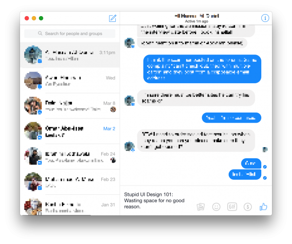
Facebook Messenger, from the team notorious for using 18,000 classes to create a simple iOS app, is back to teach you one more lesson: how to stupidly use up as much valuable screenspace as possible:
Obviously someone at Facebook is ridiculously proud of the toolbar that takes up half the available horizontal screen space for composing the message, so let’s take a moment to stare in awe at the beauty, elegance, and complete pointlessness of the in-band toolbar responsible for such a waste of space:
Now that we have finished admiring this masterpiece, can we please get our screen real-estate back? Coming from a company as supposedly “mobile first” as this one, it’s a real surprise they couldn’t make their native web interface properly responsive in a way that actually matters (no, gimmicks and special effects don’t count).
All of Facebook’s online web properties take advantage of1 – and we’re expected to believe this was the best they could come up with?
One could probably, accurately say simply for the sake of taking advantage of…) javascript, client-side rendering, and general page bloat to a far greater extent than any other online/web/mobile entity out there ((Have you tried searching in FB recently? 32GiB of RAM can’t keep up w/ how bad their client-side code is! ↩


I have 32 mb ram
But due to ram bloat, I FascistBook frequently crashes.
I have used several different web browsers with the same outcome.
I have no other troubles with my computer.