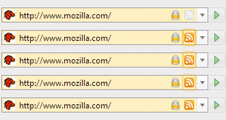
If the Mozilla has one cross-browser innovation fully licensed and acknowledged across the world, it’s their feed icon. The now infamous feed icon even has websites dedicated to it, and has successfully been adopted by Internet Explorer 7, Opera, and the much of the rest of the browser herd.
But is it about to change? Just today, the Mozilla Foundation released (on it’s official wiki) concept art for the new Firefox 2.0 theme, and something caught our eye. Is it possible that along with the new UI for tabs, buttons, and boxes, Firefox will ship with a brand-spanking-new RSS icon? It sure seems that way!
The standard icon isn’t necessarily the best or most aesthetically pleasing design (it’s not), but it is a standard by choice of the people and the developers – and as such it’s there for a reason.
The original Mozilla feed icon:
![]()
The ‘new’ design:

It’s not a mistake. Just two lines below it, the Mozilla team posts art generated with the real icon:

Whether or not the ‘new’ feed icon is actually any good is definitely up for debate, but that’s not the question. The icon has become a standard, the (more or less) official symbol for feeds and syndication – and after the hard work and effort the Mozilla Foundation put into publicizing the icon and convincing other teams to pick it up, this is quite a surprise.

I’m sorry, I don’t see the difference except that it’s shiny… meanwhile I see you’re not using the “real” icon yourself.
Nope, I’m not.
Then again, I didn’t write the original one, so I can simply claim not to like it 😛
The new logo isn’t the same – it has a bevel and the ‘waves’ have steeper curves as far as I can see…
hardly enough to justify saying they started “anew” not sure how you’re comparing anyway, you don’t have a large version of the “new” one (You’ll note the images you’re referring to are from a mock-up and no where on that page does it say those are the finished icons). If the stylizations here are enough to say it’s completely different, then how are people to know what your orange icon means, and how can you say IE has successfully adopted the Mozilla icon when it’s facing an entirely different direction?
but really you need to decide which side of the fence your on about this “standard.” Either it’s an important standard that needs to be followed strictly because even the slightest variation confuses users, or stylization is allowed. Unless you’re going to change the rss icon you use, you should probably be arguing the latter.
I’ll confess I didn’t think of it that way.
So you’re saying it’s the basic idea of a dot and two waves on orange that the ‘standard icon’ is? If it is, then I guess that makes quite a bit more sense 🙂
(And, yes, I’ll be changing my icon soon :D)