
With every new version of Windows or Office, Microsoft Corporation seems to generally like to package a couple of small freebies that make it a sweeter deal, after all, as they say: it’s the little things that count. Windows Vista and Office 2007 are no exception: not only is Microsoft apparently trying to make up for lost years (almost 6 for Vista, and four for Office), and it is doing a great job! At NeoSmart we’ve only had praise for the Office team, and we feel that the Microsoft Typography team is at the very least on-par with them, if not even higher… Once you’ve read this review, we’re sure you’ll agree.
The following are examples of 10 new Vista/Office 2007 fonts, taken in Office 2007 at 11 pts. Although Microsoft has made quite a few more new ones, these are the primarily Latin-based scripts that ship with every install, regardless of regional options. Notice that the majority of the fonts are sas-serif (at stark contrast with the theoretically more legible serif scripts for longer articles), and that, for some inexplicably odd reason, too many of them start with the letter C! (Not that we have anything against the letter C, but again, why?!)
All of these fonts have been optimized for screen-readability by the experts at the Microsoft Typography Labs; and for the first time in history, it is possible to have fonts that display great on the screen and look just as well on paper, thanks to the advanced ani-aliasing features and OpenType libraries employed.
Click each font to view a larger screen capture with a wider variety of letters, numbers, and characters.
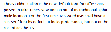
This is Calibri. Calibri is the new default font for Office 2007, poised to take Times New Roman out of its traditional alpha-male location. For the first time, MS Word users will have a sas-serif font by default. It looks professional, but not at the cost of aesthetics.
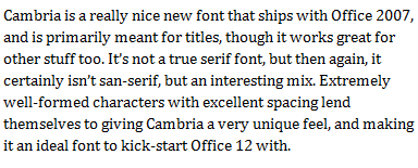
Cambria is a really nice new font that ships with Office 2007, and is primarily meant for titles, though it works great for other stuff too. It’s not a true serif font, but then again, it certainly isn’t sas-serif, but an interesting mix. Extremely well-formed characters with excellent spacing lend themselves to giving Cambria a very unique feel, and making it an ideal font to kick-start Office 12 with.
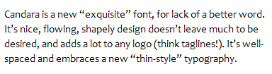
Candara is a new “exquisite” font, for lack of a better word. It’s nice, flowing, shapely design doesn’t leave much to be desired, and adds a lot to any logo (think taglines!). It’s well-spaced and embraces a new “thin-style” typography.
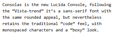
Consolas is the new Lucida Console, following the “Vista-trend” it’s a sans-serif font with the same rounded appeal, but nevertheless retains the traditional “code” feel, with monospaced characters and a “boxy” look.
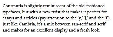
Constantia is slightly reminiscent of the old-fashioned typefaces, but with a new twist that makes it perfect for essays and articles (pay attention to the ‘y,’ ‘j,’ and the ‘f’). Just like Cambria, it’s a mix between sans-serif and serif, and makes for an excellent display and a fresh look.
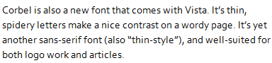
Corbel is also a new font that comes with Vista. It’s thin, spidery letters make a nice contrast on a wordy page. It’s yet another sans-serif font (also “thin-style”), and well-suited for both logo work and articles.
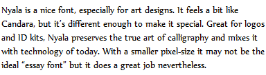
Nyala is a nice font, especially for art designs. It feels a bit like Candara, but it’s different enough to make it special. Great for logos and ID kits, Nyala preserves the true art of calligraphy and mixes it with technology of today. With a smaller pixel-size it may not be the ideal “essay font” but it does a great job nevertheless.
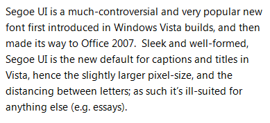
Segoe UI is a much-controversial and very popular new font first introduced in Windows Vista builds, and then made its way to Office 2007. Sleek and well-formed, Segoe UI is the new default for captions and titles in Vista, hence the slightly larger pixel-size, and the distancing between letters; as such it’s ill-suited for anything else (e.g. essays).
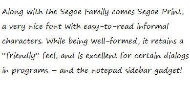
Along with the Segoe Family comes Segoe Print, a very nice font with easy-to-read informal characters. While being well-formed, it retains a “friendly” feel, and is excellent for certain dialogs in programs – and the notepad sidebar gadget!
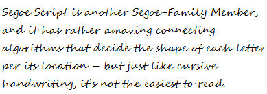
Segoe Script is another Segoe-Family Member, and it has rather amazing connecting algorithms that decide the shape of each letter per its location – but just like cursive handwriting, it’s not the easiest to read.
[images in greyscale] [digg this] [this article in spanish] [microsoft typography] [weft iii]
Too much new fonts for me.
I don´t like the Segeo family – it´s hard to read & not eye-candy enough to be beautiful.
Vista should be released soon, so I guess will be new fonts again.
My favorite font is Corbel. It’s smooth and very good readable… I use it for Several websites.
I like the Corbel and the Constantia, thank you for this list!
I love and i use Vista
I keep on succesfully avoiding Vista
I dont know what people have against Vista?
I like it and it is very usable!
I love XP, if i want something more colorful i prefer Mac…
Faggots use Macintoshes.
Please learn the difference between ?it?s? and ?its?. It?s really simple, and leads to better quality writing.
Nice review! Respect dude. Vista cool
thanks a lot.
Don’t like Vista, but gotta say that the new fonts are nice. Calibri was a very good choice as default font for Office 2007, IMO.
Well, i think the “Cambria” and “Corbel” Fonts are nice. But who really needs those new Microsoft-Fonts? There are much better fonts, so i will stay by that fonts.
Well I like Cambria too
I personally think, that VISTA is needless. What should be better on VISTA than XP?
Very nice compilation indeed. Is there actually a reason that most of these new fonts start with a “C”?
i hope, windows 7 will be great !
Why do some of the letters in the new Microsoft Office appear to colors in them. Example: An “L” reflects red and/or green on the screen.
Diana, this is an effect of the ClearType font smoothing subsystem that makes fonts look less pixely and more natural on LCD screens. These particular samples were optimized for my own screen (where they don’t appear to be colorful) and may not look exactly the same when viewed on another monitor.
Thank you so much. Me and one other co-worker received the new installation of Office and were trying to determine how it came about. I had not actually noticed at first look, but it apparent the more you look at it. Thanks for replying.
If you see the colors on your own screen, you need to re-configure ClearType.
If you’re on Windows XP or Vista, download and run this: http://download.microsoft.com/download/b/7/0/b7019730-0fa3-47a9-a159-98b80c185aad/setup.exe
If you’re on Windows 7, open “Adjust ClearType Text” in the Control Panel.
Cheers!
Great, I really appreciate the information and forwarded it to our IT Department and will take care of my setup. I can’t tell you how much I appreciate your help. Thanks.
Instead of having to download that file, there is a way to set the cleartype in windows xp manually? Thanks, Diana
No, you need to use that utility. It’s by Microsoft, there shouldn’t be any problems using it.
In my mind arial and verdana are enough 😉
Nice fonts!
“optimized for screen-readability by the experts at the Microsoft Typography Labs”
Microsoft has experts ??
Clearly. That’s why the fonts are so awesome.
I was wondering if the Vista fonts were supported by the new Windows 7. I couldn’t find the answer. After reading some of the most recent posts I have found the answer to this question. The answer is yes. Thanks, Juan
Nice review!Big Thx for this nice info
grettzzzz Membre
Hey,
really nice review.
Vista doesnt look great……..
Clearly. That’s why the fonts are so awesome
I still prefer the Oldschool Font Verdana on my Websites. I still like that Font and its easy to read, without many specials.
I think that Vista fonts are better than XP fonts.
I think that Vista is better, as it looks at Windows 7
I don’t like Vista, but i have to say that the new fonts are nice.
Where I can download this fonts? microsoft.com I can’t find
Most come with Office 2007+ and Windows Vista. You can also get them by downloading the free Microsoft PowerPoint Viewer.
I like the Vista fonts. XP was also nice 2 Years ago
although there are many awesome fonds around i am also still using verdana for most of my websites. widely accepted and good to read…
They looks fantastic…i have my old (but good) Windows XP and will stay forever with it
Nice review, the Vista fonts are great but whats abaout win7 fonts?
how do I get the Segoe font over to my XP machine if I doesn’t exist? Does Segoe come get installed by apps such as the latest Windows Explorer?
Hallo aus Deutschland! Hello from Germany!
Hallo aus Krefeld, ich bin die Nicole und war heute Nacht ein wenig im Internet unterwegs. Da mir diese Seite sehr gut gefallen hat musste ich einfach einen Kommentar hinterlassen. Ich freue mich auf einen Gegenbesuch auf meiner Seite.
Hello from Krefeld, this night I was a bit around in the internet. Because I liked this site very much I was not able to go without writing a comment. I am happy if you take a look at my site too.
Gruss Nicole. Geetings Nicole.
In my mind arial and verdana are enough 😉
Now is it time for windows 8.. i wait now for the new fonts and templates there
Segoe UI is a great successor for Comic Sans :)) … Ugly the same way, but proves to be very poplar with ocasional designer that look for an easy print design …