.NET Standard and new .NET Framework Logo and Banner

For yesterday’s NeoSmart.Collections release announcement, we had need of an updated logo for Microsoft’s .NET, and were unable to find something corresponding to .NET Standard.

For those of us that were around when C# was first introduced, this is probably the logo that most represents the .NET Framework:1

Continue reading


  1. I tried extremely hard to find this in a higher resolution or even just losslessly resized, but to no avail. Give me a holler if you have something better we can preserve! 

Google Adds Support for Customizing Homepage Background!

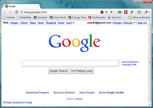
Google, ever the world’s biggest supporter of the minimal user interface, appears to be having second thoughts about the advantages of ascetic design and no-frill search pages. If you go to the Google homepage while signed into your Google account, you’ll be (pleasantly?) surprised with a small link in the bottom-left corner titled “Change Background Image.”

Continue reading

Google Hiding URIs for Certain Search Results

Google is now unfortunately hiding the URIs for certain search results far more often than they ever have done in the past… and it’s quite annoying. The Google search site is the pinnacle of function over form: it is sparse, plain, simple, and yet contains tons of information. But it seems that they’re taking it a bit too far now, hiding valuable data making the results pretty useless. Marissa Mayer, where art thou?

As an example, search Google for “libmhash” right now. The first result is the result you want, but you’d never know it from looking at the search result:

Continue reading

Does it GTK/QT/Win32 Really Matter for Chrome?

128px-GoogleChromeLogo.pngA recent article on OSNews highlights the changes expected to come in Google’s Chrome 2.0 for Windows and the progress being made on the Linux and OS X fronts for Google’s new browser.

In the article, Ben Goodger, lead Chrome UI developer, states

[Google avoids] cross platform UI toolkits because while they may offer what superficially appears to be a quick path to native looking UI on a variety of target platforms, once you go a bit deeper it turns out to be a bit more problematic.” [… Your applications end up] speaking with a foreign accent.

But there’s something we’re not getting here. Obviously given enough brilliant programmers and a good team lead to keep the different codebases in sync, going with native APIs is the better approach. But the reasons Goodger is offering aren’t very convincing.

Continue reading

Windows 7 Wallpapers Now Available for Download

NeoSmart Technologies’ gallery of Windows Vista wallpapers has been a huge hit over the past several years – despite what anyone might say about Vista itself, its collection of wallpapers and fonts is top-notch. And now it seems that Windows 7 isn’t going to be any different – from what we’ve seen, the wallpapers shipping with Windows 7 are pretty darn good.

The Official Windows 7 Wallpapers are now available for download from the NeoSmart Image Gallery. Only several wallpapers have been released accompanying various Windows 7 builds thus far, but we’ll keep adding new ones to the gallery as they’re shipped.

Here are some of our favorite new wallpapers:


You can see these and more at the gallery here, along with the old Windows Vista ones here and here.

Continue reading

Making Gmail a More Welcoming Experience

It used to be that when you opened your Gmail account you would see a bland, blank page with the text “Loading…” in the upper-right corner of the screen, as you waited for your browser to download the Gmail scripts and to make contact with the mail server to download the list of messages and other content that appears on the Gmail “dashboard.”

We’ve long felt that Gmail’s approach was not befitting of the Web 2.0 service with all its sky-blue shades and flashy appearance – and now it seems that Google’s felt that way too.

Here’s the new loading interface… Subtle, simple, and effective:

(Click image to see more changes)
 Gmail Progress Bar 

After all, first impressions are everything!

Microsoft to Push Silverlight via Redesigned Website

Microsoft SilverlightSeveral months ago, Microsoft inserted themselves into the RIA framework business – years too late and against pretty scary odds – with the initial release of the Silverlight framework. Microsoft Silverlight is the online counterpart to the Microsoft .NET 3.0 Framework and a direct Adobe Flash/Flex competitor.

Microsoft isn’t new to the whole “virtual” monopoly business (where a single company holds the entire market thanks to “superior technology” and “better business sense”) – it’s just not too often that they’re on the wrong side of this particular proverbial fence.

When Silverlight was first announced and PopFly, Microsoft’s social network built to demonstrate and hopefully kickoff Silverlight, were simultaneously launched; we were quick to appreciate the technical aspects of .NET and WPF taken online, but were careful to make it clear that we didn’t think it stood much of a chance.

But things might be on the verge of a big change. Large portions Microsoft’s website are in the middle of a redesign that will feature a fully Silverlight-powered interface – doing away with HTML and everything else. We’ve had a chance to test the new interface (currently in beta), and here’s what we think:

Continue reading